
A Vintage Mirror Gets a Chalk Paint Refresh
Hi there! Have you had a good week? I’ve been busy making a few changes around here at Adirondack Girl @ Heart and [unexpectedly] have been dipping my toes into eBay waters. So far, I’ve been enjoying myself. But today I have a simple project for you, proving yet again, how much difference a simple coat of paint can make. Do I hear an amen?!!
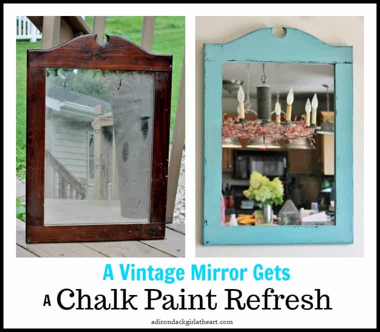
I came across another example of ugly, 80’s pine decor–a mirror this time–not with that orange-y finish I usually find, but rather with a dark, almost as equally unattractive, finish. I decided to go outside the box with my color choice and picked this pretty aqua chalk paint, rather than my normal black, beige, or taupe. So the ugly vintage mirror got a badly needed refresh.
 Very brave of me right?
 Looking at the poor sorry thing now, it’s hard to imagine what I even saw in it. Well, for $2.00, I took a chance on her.
 But after a quick cleaning and a coat of chalk paint, the ugly duckling turned into a swan.
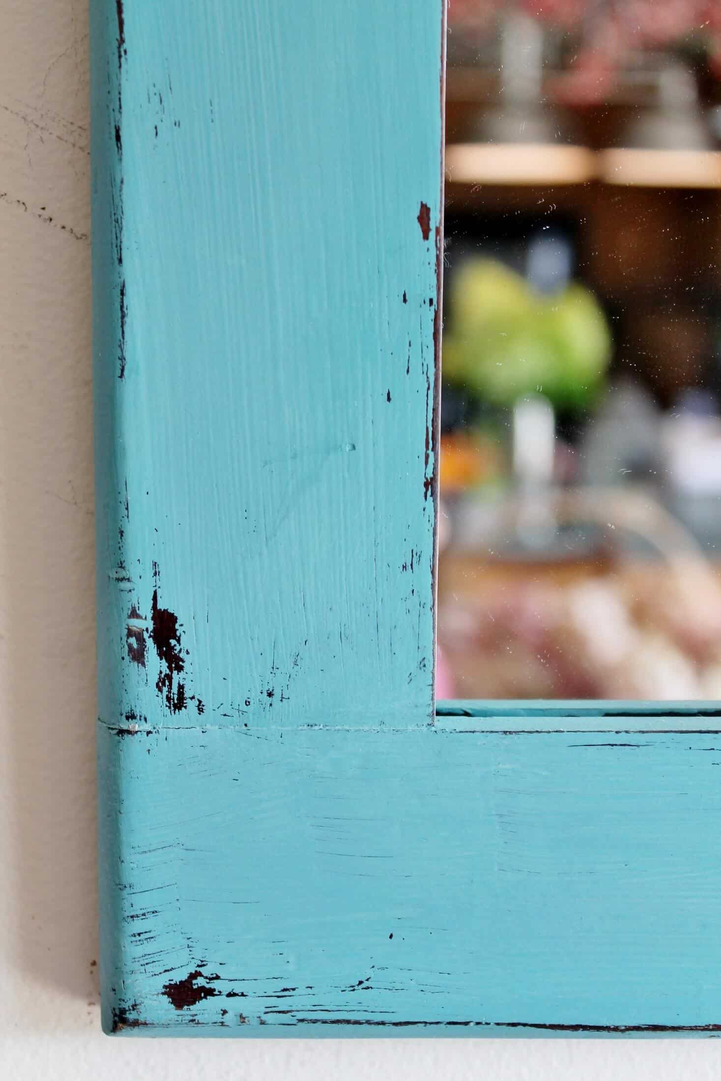
 It distressed nicely because of the dark stain underneath. I sanded it in all the places it would naturally receive wear (and probably a few that wouldn’t–oops), and then applied a coat of paste wax.
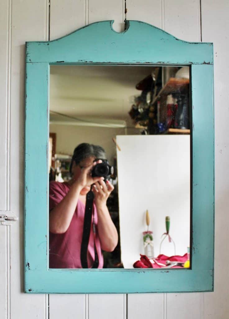 Have you ever noticed how hard it is to take a picture of a mirror? Well today you get not only a sneak peak of me in my “night shirt,” but you also see my modified light box where I take a lot of my photos. Very professional all the way around, wouldn’t you say?
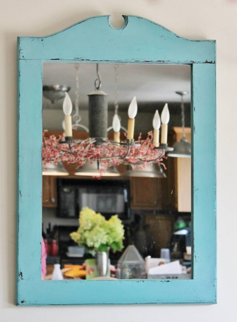 Here’s a better shot on my kitchen wall. This paint color may have made me so happy that I painted several other pieces the same shade, LOL.
Who’s with me on the joy of transformation?!! I’ve got a whole pile of vintage goodness just waiting for me and my paint brush. Guess I better get busy…
If you enjoyed your visit, I hope you’ll subscribe and never miss a post.
You’ll receive access to my brand new
Adirondack Girl Member Library
When You Click Here To
With your subscription, you’ll receive the PASSWORD to give you access to the Library
where you’ll find FREE PRINTABLES including these beautiful birthday postcards:

Bye for now,


I’d love it if you’d pin me 🙂
Love the mirror refurbish. I had to laugh at the pic of you in the mirror and your light box. I have a similar
light box and struggle with keeping myself out of the pics.
So you can relate! Thanks, now I don’t feel so stupid, ha ha 🙂
Turned out great, Diana…love the reflection photos!
Thanks Linda–a little peek at the “real” me, ha ha.
Lol, it is hard to photograph a mirror for sure! But it’s nice to see “real life” too sometimes! I love the color you chose, the mirror turned out great!
Tania
Thanks, for affirming my color choice Tania 🙂
Amen! Paint is a miracle worker! Mirror color is lovely.
Thanks so much, Sharon!
Love the transformation! I will start looking at pine objects in a new way – thanks for the inspiration!
So glad I could be an inspiration, Anita! Happy hunting–
Much improved. I am not a fan of dark wood at all!
Thanks Rose! Have a great weekend 🙂
Great makeover! And I’m answering you in yesterday’s T shirt caz this house is Maine is hotter than heck! Hope TV-phone is never a reality or I’ll be in serious trouble. This robin egg’s blue is my new favorite color for stuff (purple for clothes!). In the old days, kitchens were painted blue; flies were not supposed to like it. My grandparents front porch ceiling was a light turquoise blue and if I ever have a covered porch, I’ll do the same!
You always make me chuckle, Kathy 🙂 Never heard that about flies, guess it’s true–you learn something new every day!
Aqua is my first choice when giving a makeover….so glad you took the plunge! It looks fabulous! Yes, it is hard to photograph mirrors but we got to see that there is a real person behind the blog posts! 🙂
Ha ha–just in case anyone was wondering 🙂 Thanks for supporting my color choice, AnnMarie. Hope you have a great weekend!
You got it. Mirrors are very hard to photograph! Usually I’m doing them as product photos for Etsy, so I don’t like to have reflections in the glass. I want all the emphasis to be on the mirror. I usually have to stand at a slight angle, but even then, it’s not always possible to get one without it.
Big improvement with the aqua paint! It really makes that mirror pop! You got a great deal on it. That will sell in a heartbeat. Pinned.
I just brought it up to my booth on Friday, so we’ll see how it does 🙂
The mirror does look fantastic. I love the color. It is hard to photograph mirrors but you did good.
Thank you for your encouragement, Debra!
I hear you about the mirror photos problem, I have it all the time! Love our color choice, it’s one of my absolute favorites! xo Kathleen|Our Hopeful Home
It’s a good one! Thanks for popping by, Kathleen 🙂
It looks really nice now. I can’t wait to see the others.
Thanks so much Fonda!!
I love this! Can you tell me what paint you used and the color? I really want to paint my kitchen cabinets this color.
Hi Barbi! The paint color is “Agave” a chalk paint by Waverly. Would love to see your results!!
Love that color Diana. Turquoise and brown just go together well like chalk paint and a talented upcycler 😉 I had to laugh when you mentioned how difficult it is to photograph a mirror. I get myself in the oddest positions trying to stay out of view and when you finally get it right and download the photo, it’s like “noooo how did that dirty pile of laundry get int the picture”.